This post was originally posted on Medium.com
As some of you may have surmised from Weszt’s “More Than the Game”article, there are a lot of spaces in and around video games for UX designers to work. Today I’d like to talk a bit more about how we design at Riot, specifically through the lens of one project I worked on personally: The League Friends mobile app.

We wanted it to be app-pealing to players!
The First Steps
One of the first challenges that comes about when designing at Riot is what we refer to as “defining the problem space”. League of Legends has millions of players, and there are so many ways that we could deliver them awesome stuff. With such a large audience and spread of products across so many platforms, it’s important to understand who exactly we’re designing for and why. Opportunities are weighed against each other to determine which problems are worth tackling. After that, a team of individuals passionate about that problem will take it on, fully empowered to find the best solution in the form of a feature or product.
With the app, we decided to tackle a problem faced by our more socially engaged players. The nature of League means that oftentimes even if you log on only a few moments after another friend starts a game, you’ll need to wait 30 or more minutes until the game is over to play with them. Social minded League players could set up outside social media communication channels — but players aren’t necessarily eager to give out their personal information to their favorite top-laner. Thus, we set out to design a way for social players to communicate with League friends on the go and arrange games without having to give out more personal information than players were comfortable with.
With a clearly defined segment of players and a specific pain point to focus on, we started to explore ways in which we could connect players. Mobile seemed like perfect platform for the type of reach and messaging we were envisioning (“Wait for me! I’m almost home!”), but there were a host of questions and sub decisions that still needed to be addressed.
Which platforms (Android, iPhone, etc.) were our players on? Which phones should we support? Tablets? How would this app interact with the League of Legends desktop client?

The League of Legends desktop client
Some of these questions, like which mobile platforms to target, we could answer by pulling data, working hand in hand with our Insights department**. Other questions, like how our product would interface with other Riot products, we would need to answer with our instincts and experience instead. This is usually the balance we look for as UX designers at Riot, a philosophy we call being “data informed”.
**The “Insights” department consists of analysts and researchers who help to inform Riot teams with materials like player sentiment surveys, champion win rate data or focused player testing labs.
Forming Design Pillars
At this point in the process, with our product goals defined, it became important to develop a set of shared design values (also called design pillars). Why was this important? For a few different reasons:
- To get the entire team on board and aligned with a set of design values and give us a shared vocabulary by which we could evaluate potential designs (and avoid the dreaded “I like it” or “I don’t like it” critique)
- To be able to communicate with other designers and product owners outside the team about what the team collectively thought were the most important bits
For the League Friends app, our design pillars (in order of importance) ended up as such:
1. Unified Behaviors
We had decided early on to have the League Friends app available on both iOS and Android phones. We also wanted the app experience to fit in seamlessly with the messaging and friend experiences we knew players had been having for many years already on the desktop client. That’s a lot of different platforms where you could potentially interact with the exact same people or things.

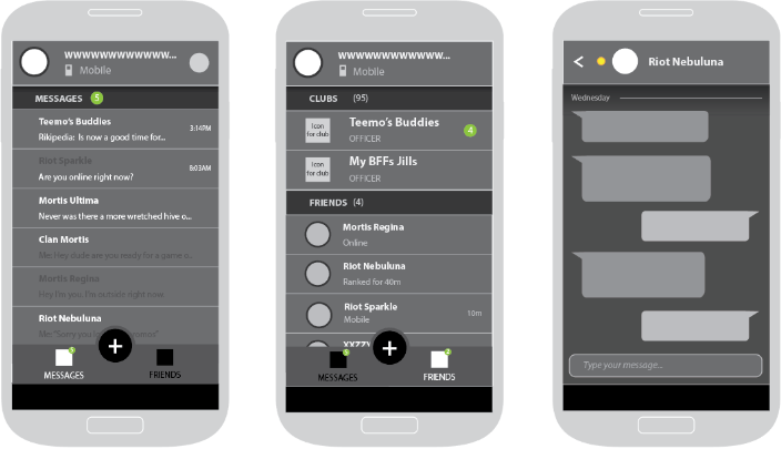
A message cell in the League Friends app
Thus we decided something like a message object, for example, should act similarly no matter what Riot platform you’re using to view and respond to them. We felt players would expect similar behaviors from similar objects, no matter where they were. We wanted the app experience to feel the same as chatting on League from your computer and to present a cohesive messaging experience spread across a suite of products. So we strove to have all major actions and behaviors aligned across platforms.
Now, this doesn’t mean everything is exactly the same in all instances (not by a long shot) but when we did choose to deviate, it was based on our second design pillar below.
2. Platform Specific Details
This pillar, in its essence, represents the team’s desire to make sure that every product felt “native” to it’s own platform. That meant that many of the smaller details, like gestures for example, were very platform specific. We didn’t want players using the Android app to feel like they were getting an app specifically designed for iOS or for mobile players to feel like they were getting something intended to launch on desktop.

Platform specific menu components in the Android (left) and iOS (right) League Friends apps
This pillar manifested in a thousand tiny ways, from smart notification bundling on Android to using action sheets for iOS options (pictured above). We worked hard to find the right balance in many places. Our Visual Designer even created a graphical fusion of League’s established fantasy skeuomorphic style and the flatter tendencies of Google or Apple’s styles specifically for our mobile products. In the end, we wanted to respect all the expectations that players would come to our app with — whether they came from League of Legends or from the OS itself. No one wants to use something they feel wasn’t made for them.
3. Optimize for the Majority, Allow for the Minority
This pillar may seem obvious in some respects, but it was important that we called it out. One of the coolest things about designing for the League of Legends audience is that there are so many passionate players who all attach to different parts of the game or its surrounding products. That little bit of functionality you thought “nobody” used? That is some player’s absolute favorite thing, without fail. Thus, while we may put a big call to action button for the most commonly used functionality, we want to remember and respect the lesser used features as well. A great example of this is the hierarchy of some of the functionality in the profile screen.

The League Friends mobile profile screen
Most of the time, when a player taps on a friend, they want to chat with them or maybe see some info about the game that friend is in. However, a lesser used option available is the “buddy note”, where players can write a short note about their friends like “This is your brother, Jake” or “Don’t let this guy play Jhin”. This option is important in a world of changing screen names and friends that you may not know the real name of, but it’s not used by every player. Thus, according to this design pillar, we kept the ability to add or edit a note (it’s the little pencil!) but your in-game information (the character you’re currently playing is the big background picture)and the ability to start a chat have far more prominence in the hierarchy of the screen.
4. Flexibility
This pillar was very important to us as a product that plans on continual releases and updates (much like all of League of Legends). Essentially, we wanted the design to meet all of our current goals but, as best we can, allow for expansion and growth in the future. If we knew a feature was going to be added in a future release, we wanted to make sure it had room to be added. Could we add more options in the Settings menu later? Approximately how many (probably about 5 more categories before it got messy)? As much as possible we tried to avoid “designing ourselves into a corner,” creating patterns that could be built upon later without breaking.
One such example would be what we call the “boxed notification system”. This system exists in-app and can use it to display many different kinds of notifications.

A single friend invite and multiple club invites in the app’s “boxed notification system”
When we launched the apps, the only example in this system was the friend request. A single friend request would show the option to accept or decline upfront without leaving the context of the friend list. Multiple requests would “box up” into the same single cell on the list, with a tap bringing the player to a dedicated “Friend Requests” screen. There, the player could go through and mass accept or decline the requests.
When the system was designed, even though we only knew of one kind of notification, we took a stab at what kinds of other social invites or requests could be added and made sure it was generic and flexible enough to handle a variety of social objects. Then, when the Clubs social feature came down the line a little bit later and we decided that accessing it through League Friends was important, we were prepared! Club invites could be and are handled in the same system with ease.
It’s worth noting that not all of the design values we wrote down at the beginning were exactly what we ended up with. Some additional pillars became apparent as we discussed designs and some were not quite the right words the first time around; we tweaked them as we went through the iterative process (and that’s okay!). Everyone on the team had input into the creation of the design pillars, and we stack ranked them to make sure that when we needed to make a tough decision we knew what took priority in the end. The pillars provided us with a strong foundation from which to build and iterate in our next step.
The Part Where You Wireframe
Early League Friends wireframes
So this stage of the process after aligning on our design pillars is actually where most of the UX artifacts are created. There are wireframes, yes, but there are also sitemaps, documents about behaviors, error messaging (somebody’s gotta write that), style guides, support FAQs and much more. In general, my design process at this stage goes something like this:

The UX design process involves a lot of explaining, soliciting feedback and refining
**“Stakeholders” at Riot are generally people your work touches. This means either people who are responsible for you and your output, or people on other teams who will need to coordinate with the product you’re making.
There can be a few extra or a few less steps in this process depending on what you’re working on and with whom. For example, on my current project I’m working with game designers, so I tend to split out the steps of getting feedback from the team a little more when it comes to something like in-game UI.
When wireframing League Friends, I ended up dividing the app into “zones”. Navigation and all important actions are at the bottom of the screen to account for all kinds of screen sizes (it’s pretty hard to reach the top of many “phablets” nowadays), contextual information for the screen is always at the top, and content is in the middle. This goes back to our original philosophy around flexibility — if you could categorize something you’d like to add to the app in the future, you’d know approximately where to put it based on the zones.

In this image, the red area is contextual info, blue is options, yellow is content and purple is navigation
Eventually (well, usually pretty quickly actually), you’ll get to a degree of confidence with the screens where you’re ready to stop tweaking your wires and dive into the next step of the design process — testing!
Testing, Testing, 1, 2, 3
We don’t wait on everything being pixel-perfect to test here at Riot. We test early and we test often. This usually means a prototype! Depending on what’s being tested, it can be an advanced prototype with many screens and interactable objects, or it can be a click-through of a few screens — or it can even be a small movie. A UX’er can whip it up alone using a prototyping tool or can work closely with a developer to create something custom. As in the “The Part Where You Wireframe”, this is very open to how you as a designer would like to work.
I generally like to perform small scale tests with Rioters while some of the screens are being mocked up by a Visual Designer. I don’t really have a preference for tools, but with the League Friends app we used a program called POP to test on phones of all shapes and sizes.
Once we had run some testing with Rioters, we moved on to testing with small groups of players. We knew that the pain we were trying to solve for with the app directly impacted more socially active players, so worked with the Insights team (we work with the Insights team a lot, as you can tell) to set up labs with players who specifically self-identified as liking to play with friends.
Running a player lab at Riot is much the same no matter what project you’re on. Generally, you have a specific points in the product you’re testing for (How discoverable is this button? What does a player expect to happen when they tap this? Is this piece of concept art appealing to this type of player?) and use these to set up a testing plan.

The Player Research Lab at Riot Games’ campus
Insights runs the sessions of exploration and Q&A with the prototype or product, usually with a written component you can view and an accompanying video. Insights folks will usually establish with participants that they aren’t actually the ones working on the project; this means players are more comfortable giving out totally honest opinions (i.e the most helpful ones).
For many League of Legends projects, the next step in testing, after many iterations based on player labs feedback, is deploying to what we call the “PBE” or the Public Beta Environment. There, thousands of players can use your feature and give feedback through our forums (“Boards”) or surveys.
For the League Friends app, we didn’t have this stage of built-in mass testing (there’s no PBE for mobile League of Legends apps) so we devised our own. We asked players and Rioters to sign up for a “Beta” program and give us feedback through a built in “Feedback” page. Suddenly we had thousands of players giving feedback through the app, which was awesome! We could see what topics were important to players and track how players felt generally about the app over time.

The in-app Feedback screen. There’s a separate form for bug reporting too.
This feedback page is what the live app still uses today to assess how players are feeling and what features we might look at in the future.
Hit the Big Red Button
Alright, so you have something you and your team are confident in through iteration and testing, and you’re all ready to hit the big red button to go live. You might be wondering if there’s anything left for a UX Designer to do at this point. Answer: Yes. There is.
As stated above, we try to continuously ship to players and strive to improve on experiences even after they go out. There are some exceptions to this, such as tightly windowed content (a one time event website, for example, may not get additional polish stages) but in general, there will many smaller details to add in, even after launch.
For the League Friends app, we found many wee additions to put in after launch, like parallax effects on on our Android background or animation touch ups for our creation menu options. Of course there were larger features too, like the addition of group Clubs, but follow-through on the small details was important.

The creation menu lets you start a new conversation or add friends on the go. PS This is not the polished animation, just a quick gif to give you an idea.
There are also bugs to find and squash. We do our best to get those before release, but when your app/game/site goes out to millions of people, there are bound to be a few new ones that crop up. The best-case scenario is if someone on your team finds the bug first before it can have a big impact on the experience. So pick up your phone or click on your website or play the game and try to find some!
If I have one piece of advice to impart for any UX Designer anywhere it is this: Use your product in your daily life. Use it in your daily life. You should continuously play with the thing you’ve built, even long after it’s released. If it’s not something you would use outside of your workplace, use it every day when you’re there. There’s no better way to understand the triumphs and failures of your product or feature than depending on it yourself.
At Riot, we aspire to be the most player-focused company in the world. Empathizing with players, the people who use our products and play our games, is so important. There’s no better way to do that than to join them, to listen to them and represent their perspectives as best as you can.
Beyond Launch
So that’s it. That’s the full process we went through designing the League Friends app, and a behind the scenes glimpse at the process of UX design at Riot. The League Friends app launched back in late January 2016 (feels like only yesterday 😭), and since then has had over a million downloads in the Google Play Store alone. The app has over a 4 star average rating on both iOS and Android, but the team is still continually working to improve and add additional features and polish.
If you made it this far, let me just say thanks for reading! Thanks for sticking with me on this deep dive into the League Friends app.